Branding Project
For the following project, we were challenged to create a brand kit to showcase our personalities by building a cohesive aesthetic along with its corresponding materials to accurately represent the motifs and message of the brand. This branding project aimed to attract an audience of young adults, specifically those who still have nostalgia for early 2000s fashion and technology. Below, you'll see some examples of how this brand would work.
All items for this campaign were created using Adobe. The logos and graphics were created in Adobe Illustrator and then edited onto billboards and promotional material using Adobe Photoshop.

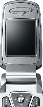
CRIS TELECOM
Step back into the era where style and technology collide! Cris Telecom is here to make flip phones the ultimate fashion statement for those looking to stay connected and express their individuality. With Cris Telecom, your phone isn’t just a gadget, it’s your canvas! Choose from bold colors, trendy patterns, or glittery finishes to showcase your vibe. Feel like switching things up? Swap out the covers for a fresh look every day! Our Sleek and compact styles are perfectly sized to fit your pocket, purse, or wherever life takes you. Wherever life takes you, Cris Telecom flip phones keep you connected in style. Your phone, your vibe, your world.
Primary Logo

The main logo for the brand made sure to include my name as an homage to the purpose of this brand. This logo takes heavy inspiration from the Y2K futurism aesthetic. Futurism was a very popular design in the 2000s, showcasing thick letters with heavy shadows and many elements like stars, circles, lines, and more. I made sure my design included all aspects that made these designs fun and interesting.

Positive

Negative
This logo was created to have a simple look but still convey the early 2000s aesthetic of futurism and edge.
This version of the main logo in black and white is an important addition to make sure the logo can work on multiple forms of media, as well as ensuring the contrast and accessibility of the design. This logo can be used for simpler media like watermarks, small icons, presentations, and even newsletters or engravings.
Symbols


For the symbols in this brand, I decided to include the most recognizable aspect from the main logo and make it into a simpler yet solid outline. Since the brand specializes in phones and technology, the simplicity of this design takes other similar brands into consideration to create a symbol perfect for placement on products and engravings.
Colors
#6755a4
#c9b7e8
#c5e9f5
#f285d2
The color palette for this brand was mainly chosen to be attractive and bright. By having uncommon colors, it will make brand recognition easier from afar.
The color Purple #6755a4 is the primary color for this brand and was chosen not only because it's my favorite and showcases my personality in this brand, but also for its versatility and combination potential. All secondary colors are mainly used only for backgrounds and promotional graphics, but can never be used for the logo itself.
Typography
a b c d e f g h i j k l m n o p q r s t u v w x y z
Fit Wide
60 pt.
Aa Bb Cc Dd Ee Ff Gg Hh Ii Jj Kk Ll Mm Nn Oo Pp Qq Rr Ss Tt Uu Vv Ww Xx Yy Zz
Lucida Sans Unicode
16 pt.
14 pt.
Fit Wide can only be used for Titles and on a large scale only. For any other text within the brand, Lucida Sans Unicode must be used, since Fit Wide is not suitable for smaller text. This includes websites and advertisements.
This choice was made to maintain cohesiveness. Fit Wide was used for the main logo design and likewise fits for any other main written articles. Lucida Sans maintains the same square and straight typography that was popular in the 2000s and therefore seemed like a good fit for the rest of the text in the brans.

I chose to add these graphics to this area because the audience is on the go, and following other tech companies' examples, it made sense to add them in busy areas. This ad would be printed and placed in bus stops and other commercial buildings.
This would help with visibility and brand recognition since anyone who saw the unique color palette would surely remember it later.

These other graphics would be window films. Likewise, placed along busy streets and commercial areas to gain the most attention. Its bright colors and simple text would bring attention to them from across the street.
These designs are also catered towards the younger target audience who would be intrigued because of the familiar yet different visuals.